For many people, the first encounter with a brand happens on a screen: a search result, a social profile, a link shared in a chat. An online presence is the sum of those small encounters, and design is what ties them together. This guide looks at how to plan and build a visual presence online that is clear, consistent and practical to maintain.
Start with the identity, not the platform
It is tempting to begin with a website theme or a social media template and adapt the brand to fit. The result usually looks like the template. Begin instead with the identity itself: the logo and its variations, a small colour palette, one or two typefaces and a sense of the tone you want to convey. These decisions then guide every platform, rather than each platform pulling the brand in a different direction.
Make the website the reference point
Social platforms change their layouts and rules often, but your own website remains under your control. Treat it as the most complete expression of the brand. A strong site usually has:
- a clear header with the logo and a short, readable navigation;
- a type scale with distinct heading and body styles that remain legible on small screens;
- generous spacing, so content is easy to scan;
- colour used deliberately, with sufficient contrast between text and background;
- images that match the brand's agreed style rather than generic stock photography.
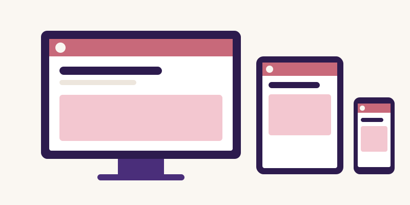
Design mobile layouts as carefully as desktop ones. A large share of visitors on many sites arrive on phones, and a layout that only works on a wide monitor will undermine the impression the rest of the design creates.
Adapt the logo for small spaces
Online, a logo often appears at sizes far smaller than on a printed page: browser tabs, app icons, circular profile pictures. A detailed wordmark becomes unreadable at these sizes. Prepare a compact mark, such as an initial or a simplified symbol, that remains recognisable at 32 pixels or less. Test it on both light and dark backgrounds, since many interfaces now default to dark mode.
Create a consistent social media look
Each social platform has different image ratios and profile layouts, but the same brand should be recognisable on all of them. Useful practices include:
- using the same profile image across platforms;
- designing cover images from a shared template that adapts to each platform's dimensions;
- building post templates with fixed positions for headlines, logos and imagery;
- keeping a limited set of colour combinations so a feed reads as a whole.
Templates do not have to make every post identical. They provide a frame so that variety in content does not become chaos in appearance.
Do not forget email and documents
Email newsletters, signatures, invoices and PDFs are part of an online presence too, and they are often the least designed. Email clients support only limited fonts and layouts, so define a simple email template that uses brand colours and a web-safe fallback font. Give everyone who sends email the same signature format. Small details such as a consistent sign-off and logo size add up to a more professional impression.
Write with the same voice
Visual consistency is undermined if the words change personality from one channel to the next. Agree on a few voice principles, for example plain language, short sentences and no exaggerated claims, and apply them to website copy, captions and email alike. Honest, specific wording also builds more trust than superlatives that readers have learned to ignore.
Prioritise accessibility
An accessible presence reaches more people and usually looks cleaner as a result. Check colour contrast for text, add meaningful alternative text to images, avoid placing important text inside images, and make sure links and buttons are clearly identifiable. The Web Content Accessibility Guidelines (WCAG) published by the W3C are the widely used reference for these checks.
Maintain it over time
An online presence is never finished. Schedule a periodic review of the website, each social profile and recent emails together. Update outdated images, remove inactive accounts rather than leaving them abandoned, and keep the shared brand files current. A smaller presence that is well maintained is more convincing than many channels that look neglected.
Summary
A strong online presence comes from a clear identity applied consistently: a website that serves as the reference point, a logo that works at tiny sizes, social templates that share a common frame, and emails and documents that match. None of this depends on a large budget. It depends on deciding how the brand should look and sound, and then applying those decisions everywhere people meet it.