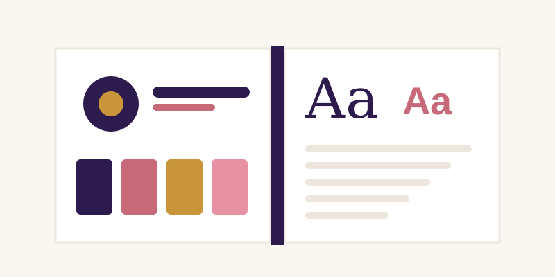
A brand identity rarely breaks all at once. It drifts. A new social channel uses a slightly different shade of the main colour, a sales deck is built with a default font, someone stretches the logo to fit a banner, and within a year the brand looks like several companies. Consistency is not about rigid rules for their own sake. It is what lets people recognise you quickly and trust that each touchpoint comes from the same place. Here are ten habits that help a brand stay coherent while it grows.
1. Write down the core decisions
Most inconsistency starts with decisions that only live in one designer's head. Record the essentials in a short document: the logo versions and when to use each, the colour values, the typefaces and their roles, and a few examples of the overall tone. A two-page summary that people actually read is more useful than a hundred-page manual nobody opens.
2. Define colours in every format you need
A colour that is only specified as a hex value will be guessed at in print, and a colour only given as a Pantone reference will be approximated on screen. List each brand colour as HEX and RGB for digital work, and CMYK and a spot colour reference where print matters. Note which colours are primary, which are accents, and which combinations pass contrast requirements for text.
3. Give typefaces clear jobs
Rather than simply naming two fonts, state what each one does: headings, body text, captions, numbers in tables. Include sizes and weights for the common cases and a fallback system font for situations where the brand fonts are unavailable, such as email clients or office documents. Check that the licences cover every place the fonts will be used.
4. Supply ready-made logo files
People misuse logos most often because they cannot find the right file. Provide the logo in a small set of formats (SVG for the web, PNG with transparency, a high-resolution version for print) and in its main variations: full colour, single colour, reversed for dark backgrounds and a compact mark for small spaces. Show minimum sizes and the clear space around the mark.
5. Build templates for repeated work
Presentations, social posts, invoices, letterheads and email signatures are produced again and again, often by people who are not designers. Templates with the grid, type styles and colours already set up remove most of the room for drift. They also save time, which makes people more likely to use them.
6. Set rules for imagery, not just graphics
Photography and illustration carry a brand as much as the logo does. Describe the style you want: lighting, colour treatment, how people are shown, whether illustrations use outlines or flat shapes. A small board of approved examples, alongside a few clearly marked "not like this" examples, communicates more than paragraphs of description.
7. Keep one source of truth
Store the guidelines, logo files and templates in a single shared location and link to it everywhere. When copies are emailed around, old versions survive for years. If the brand changes, update the central files first and announce the change, so people know to stop using what they downloaded earlier.
8. Review new channels before launch
Every new platform brings its own constraints: square avatars, tiny favicons, dark-mode interfaces, video thumbnails. Check how the identity behaves in each format before the account goes live. A compact logo mark and a defined approach to dark backgrounds solve many of these problems in advance.
9. Allow flexibility on purpose
A brand that cannot flex tends to be ignored rather than followed. Decide which elements are fixed (logo, core colours, primary typeface) and where people may adapt, such as secondary colours for campaigns or illustration styles for a seasonal series. Clear boundaries make it easier to say yes to good ideas without losing coherence.
10. Audit regularly
Once or twice a year, gather a sample of real material: the website, recent social posts, printed items, slide decks and emails. Lay them side by side. Inconsistencies that are invisible one at a time become obvious when everything is in view. Fix the templates or guidance that caused them rather than only correcting individual pieces.
Consistency as a habit
None of these steps requires a large team or expensive software. They depend on making decisions explicit, putting the right files where people can find them, and checking the results now and then. Small brands benefit most, because every touchpoint counts when an audience is still learning who you are. A brand that looks the same on a business card, a phone screen and a slide is easier to remember, and that recognition is the point of an identity in the first place.